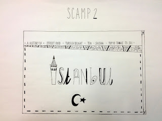
Task: To design three scamps for the 'History of website'. Need to consider layout, navigation and content.
Questions to be critted
1. Are their too many paged on the website?
2. Should I fous on just one aspect for example, Turkish tea, therefore being more specific?
3. How does the navigation layout work- is it easy to get around and labelled clearly?
4. Do you think the simpler design works with more type and less image or the busier deign with a more illustrative style?
5. What pieces of layout are strong and which bits need improving?
Feedback
Strengths
- The navigation layout works well on each of the stamps and the illustrations make it obvious to what they are linking to.
- The number of pages on the website suits the concept and content on each page.
- Scamp 1- the images and layout speak for themselves so don't see any areas for improvement.
- The top ten is a strong idea (scamp 3).
- All the labels are clear.
Considerations
- If scamp 1 had pictograms for the navigation there would be the illusion of less on the page.
- Add colour in small bits with limited pallet.
- Scamp to is unclear as to where the info would be when a navigation button is clicked on.
- On scamp 1, rearrange order of navigation, follow the order of scamp 2.
- Scamp 1 seems to work the best as the other two are slightly too simplistic. Scamp 1 also seems to capture the personality and reflects the Turkish culture the best.


No comments:
Post a Comment