This third booklet is going to look into several types of printing.
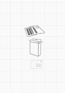
To begin with a few design sheets were produced to create a visual starting point. The sheets mainly propose ideas for the layout and where the content is going to look best. As the booklets are going to work as a set, it is important that the layout does not change too much but also offers a bit of variety to the reader.
Areas of focus
Similar to the previous booklets, the same aesthetics and type is being used to communicate the subject areas of what this book will offer. Their will again be ten pages of content, two pages on each printing type. Therefore this booklet will be focussing on the following five print variations. The prints I chose were ones that I am either interested in doing or that I really had no idea about.
Main Images
Using Illustrator, some illustrations were designed to communicate a couple of examples for each type of printing. For example, to show what screen printing could be used for, a t-shirt, ballon and sign were created. Having some visuals next to the content makes a subject easier and quicker to relate to. The colours used matched the title of that type of printing. The layout of the collection of objects was experimented with. As each object was different place, it was crucial to make sure that the composition would compliment the rest of the page layout.
Screen printing
Pad Printing
Flexography
Rotogravure
Web 'offset'
Experimenting with layout
On Indesign, the experimentation with layout took place. The layout needs to tie in with the rest of the books but not exactly same as it can;t be too repetitive. So by keeping the main imagery the same and the layout slightly varied
Pad printing-pages 1&2
Screen printing-pages 3&4
Flexography-pages 5&6
Rotogravure-pages 7&8
Web 'offset'-pages 9&10


No comments:
Post a Comment