Showing posts with label Design for print. Show all posts

Wednesday, 30 January 2013

OUGD504//EVALUATION

Self-Evaluation


1.  What skills have you developed through this module and how effectively do you think you have applied them?

As this module has been quite long at thorough I feel as though I have improves my project management skills. At the beginning of the academic year I felt as though I didn’t do much work but as the projects have built upon each other I have become focussed and organised on what I need to do. I have done more hands-on processes, especially in the last brief. This is something that I have also wanted to do but never left enough time or didn’t really know to go about doing it. Learning how to screen print as laser cut has given me the confidence to apply it in future projects.

2. What approaches to/methods of design production have you developed and how have they informed your design development process?

The approach and perspective of this project has been different to any one I have done before. I have obviously never made a website before and very proud of my self for doing so. It is much different than I imagined and want to improve my understanding of code as I think it is an impressive skill to have. Obviously being more hands-one gave me a different perspective of design and taught me that I need to handle my time well to do more traditional processes.

3. What strengths can you identify in your work and how have/will you capitalise on these?

I think one my strengths is learning new techniques and skills. In this module I tried lots of new things, coding a website, laser cutting, screen printing and foiling. All of theses things are very different. I was better at some than others but I enjoyed learning and applying every single one of them. However I think they are skills that I need to keep developing to get better and quicker at them, so this is something I want to carry on doing.

4. What weaknesses can you identify in your work and how will you address these in the future?

I feel as though sometimes how my final outcomes and development are presented lets me down. I think my presentation boards could be greatly improved and this is something I want to work more on. I’m not very good at picking out which are the important bits and displaying them in a professional manner. I think to help me with this I need to improve my photography skills and get some good pictures of my final outcome. I need to learn to leave more time at the end of a brief to make finishing touches to presenting my work. I find that research really lets my blog down; I obviously research as I go along but never actually put it on my blog until the end so therefore it is not as in much depth.

 5. Identify five things that you will do differently next time and what do you expect to gain from doing these?

Next time I will try and make sure I stick to a proper timescale in terms of balancing out research time and designing time. This will hopefully give me a more reliable and valid outcome. Also now I have seen a different approach to a project I can take what I have learned and apply it to the next one. I think I will experiment more with different outcomes of design as I really enjoyed the construction side of my products, which isn't something I often do. Hopefully by doing this I will broaden my knowledge of design and it will also test my composition and printing skills. Next time I want to do even more screen-printing, as it will improve the outcome whether it is paper or fabric. Also, I really enjoy doing something that is away from the computer. Lastly, I think I would try and do more primary research because I think it is more beneficial. I would like to take a more practical approach to it and have something as a creative a response, rather than just writing and images. For this project I have so many ideas for primary research but because of time management, I did not get around to doing all of them.

6.How would you grade yourself on the following areas?

Attendance- 5
Punctuality- 4
Motivation- 3
Commitment- 4
Quantity of work produced- 3
Quality of work produced- 3
Contribution to the group- 3
Friday, 25 January 2013

Design for print//Printed

Here is one of booklets printed out in A5 format to show what they would all look like. The stock chosen to print on was Antique White. 


Friday, 30 November 2012

Design for print//The sleeve

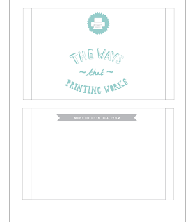
The booklets are obviously a set of three so here is the design of the sleeve that will keep them all together. The sleeve will be printed on A3 as thats the smallest size that the net can be fitted on. 


Thursday, 29 November 2012

Design for print//Development from crit

Overall, the colour modes book had the most positive feedback out of the set. The only thing changed on this booklet is the leading to make the type for legible. In fact, it was the layout and hierarchy of this booklet that influenced the change of the others. 


Wednesday, 28 November 2012

Design for print//Development from crit

Similarly to the last, to improve the formatting booklet, the hierarchy and layout was changed to keep as a set with the others and it is the most effective. The 'A' formatting diagram was also changed to magenta instead of red. 


Tuesday, 27 November 2012

Design for Print//Developing from crit

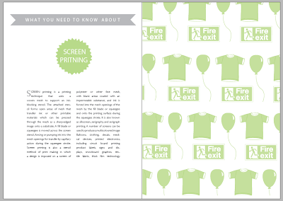
After getting feedback from the crit, it was suggested that the illustrations within the 'printing' handbook looked a bit lost in the page and left a lot of white space. Taking this on board, using the original illustrations, a repeated pattern was created using a clipping mask in illustrator. This makes the pages look like their is more going on while still communicating examples of the print process. The layout with the left page was also rethought out. In the crit it was suggested that the hierarchy worked best in the 'colour modes' book so therefore the other books have been altered to match this layout. 


Wednesday, 21 November 2012

Design for print//Final crit

Strengths

  • Very clear illustrations, legible.
  • Like the paper formatting
  • The pencil illustrations are effective
  • The illustrations are a different approach to what everyone else has done.
  • The use of colour is very strong and helps separate each section.
  • The illustrations give context to the different print processes. 
  • The pencils are a good way to shows the colour mode, gives the topic a fun edge.


Areas for improvement

  • The spot colour illustration is unclear.
  • Could experiment with the layouts more.
  • Watch out for widows.
  • Text needs more leading.
  • Use a heavier body text, hard to read on ISSU.
  • All illustrations should match the pencil illustrations, make sure fill the page, less white space.


Sunday, 18 November 2012

Design for print//Final Booklets

Here are the final booklets in an interactive layout. This shows the way the booklets would look. 


Friday, 16 November 2012

Design for print//Developing printing types

This third booklet is going to look into several types of printing.

Design sheets//layout

To begin with a few design sheets were produced to create a visual starting point. The sheets mainly propose ideas for the layout and where the content is going to look best. As the booklets are going to work as a set, it is important that the layout does not change too much but also offers a bit of variety to the reader. 


Areas of focus


Similar to the previous booklets, the same aesthetics and type is being used to communicate the subject areas of what this book will offer. Their will again be ten pages of content, two pages on each printing type. Therefore this booklet will be focussing on the following five print variations. The prints I chose were ones that I am either interested in doing or that I really had no idea about. 


Main Images


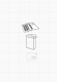
Using Illustrator, some illustrations were designed to communicate a couple of examples for each type of printing. For example, to show what screen printing could be used for, a t-shirt, ballon and sign were created. Having some visuals next to the content makes a subject easier and quicker to relate to. The colours used matched the title of that type of printing. The layout of the collection of objects was experimented with. As each object was different place, it was crucial to make sure that the composition would compliment the rest of the page layout. 

Screen printing


Pad Printing


Flexography 


Rotogravure


Web 'offset'


Experimenting with layout


On Indesign, the experimentation with layout took place. The layout needs to tie in with the rest of the books but not exactly same as it can;t be too repetitive. So by keeping the main imagery the same and the layout slightly varied  


Pad printing-pages 1&2


Screen printing-pages 3&4


Flexography-pages 5&6


Rotogravure-pages 7&8


Web 'offset'-pages 9&10