Tuesday, 27 November 2012
Design for Print//Developing from crit
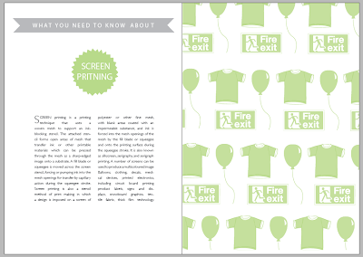
After getting feedback from the crit, it was suggested that the illustrations within the 'printing' handbook looked a bit lost in the page and left a lot of white space. Taking this on board, using the original illustrations, a repeated pattern was created using a clipping mask in illustrator. This makes the pages look like their is more going on while still communicating examples of the print process. The layout with the left page was also rethought out. In the crit it was suggested that the hierarchy worked best in the 'colour modes' book so therefore the other books have been altered to match this layout.
Subscribe to:
Post Comments (Atom)


No comments:
Post a Comment