Typefaces
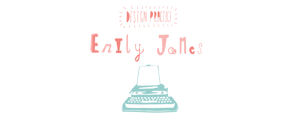
Here are a few titles that will be used in the publication. They are shown in various display fonts that could be appropriate.


After experimenting with typefaces, 'Hill house' with a lowered opacity in 48pt, was layered onto a background image and was the most effective.
No comments:
Post a Comment