Tuesday 30 October 2012

Design For Print//Design Sheets

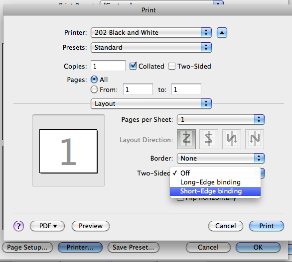
Some design sheets to communicate the beginning of the design for print publication. Need to consider layout, design and content. A few different formats have been focused on to see which is the best way to present the information. 


Going to focus on three main areas of printing; colour modes, types of printing and formats. Would rather discover more in depth on fewer subjects that vaguely focus on multiple. 


Considering designing the content in a story like way. Find it easier to learn things when content is applied in a step by step formation. Also want to present the information in a way that legible and relatable. For example, to inform the audience on PAD printing, using a golf ball as an example of the process would make it more contextual and easier to apply to own printing ability.


Trying to achieve the best possible format for presenting the information. Three books need to be compacts and work as a set. Keeping them all together and portable is a key factor. Considering a format like a flip book could be effective but maybe harder to read and not as well categorised. 

Thursday 25 October 2012

Type workshop//2

Taken from the typography task, giving the typeface three personality traits was the next challenge. Each typeface communicates a different message and tone depending on its aesthetics. Basically saying, if the typeface was person was aspects of their personality would be emphasised. The following words below is how Perpetua came across. 


A brand that the typeface would communicate well:


A brand that the typeface would NOT communicate well:


Kerning

It is important to considerate how to kern type in order for it be as legible as possible. Kerning is the space between each letter. Making it bigger or smaller will determine the aesthetics of the word or sentence. 


Composition
The next task was to take the numbers in written form; three, two one. Then by experimenting with the point size, layout and weight try and and make it read 'One, two, three'. 


. . . . . . . . . . . . . . . . . . . . . . . . . . . . . 


. . . . . . . . . . . . . . . . . . . . . . . . . . . . . 


. . . . . . . . . . . . . . . . . . . . . . . . . . . . . 


. . . . . . . . . . . . . . . . . . . . . . . . . . . . . 


. . . . . . . . . . . . . . . . . . . . . . . . . . . . . 


. . . . . . . . . . . . . . . . . . . . . . . . . . . . . 


Wednesday 24 October 2012

Design Production Workshop


What is a website for?
  • Promotion 
  • Informing
  • Persuasion
  • Contact
  • Entertainment 
The audience is NEVER for everyone. 

Three factors of a website
  • Check it actually works (functionality)
  • Aesthetics-is it visually appealing?
  • Does it work well? (usability) 

Making a website
  • Landing pages?-For every page, ask why?, what is the point? 
  • Need a contact page-Email, physical location and address, telephone number, business networking and online presence. 
  • About page- Is it relevant to the clients who want to appeal to? 
  • A CV page-If you show your portfolio do they need to see your CV? Let the work speak for itself.
  • A shop-Depending what type of designer your are.
  • A blog/news feed could go on Homepage to show active work and what is currently going on in terms of your design. 
  • Clean layout But unoriginal-make it different. 
  • Navigation
  • Redundant features- get rid of them. 
KISS- Keep, it simple stupid. 


This is the homepage that I designed for myself. I decided to go for something more illustrative as this reflects my practice. I thought that the typewriter could be a place of daily blog updates and what is going on. The scroll bar on the right will be a way of scrolling down te paper on the typewriter therefore making it more interactive. The navigation is placed across the top as this is a clear location to put it and people are familiar with this sort of layout. 

This this the feedback received:


Design for web//Workshop # 1

Reactions to websites

  • Indexibit > free website creator. 
  • Should be the content that makes the website look good, not the actual design of it. 


Ollymoss.com - Black, empty, spacious, small type, simple


MalikaFavre - Busy, flashing, moving, grid, colours.


360langstrasse - Circle, picture, background.


Noble-design - simple, ikea, japan, vector. 


caavadesign - circle, california, pastels, geometric.


Squarespace- photo, simple, art, wood, type. 


rainbow primates- glitter, scary, busy, lilac. 


Cat bounce- cats, movement, white.


Three key questions
  • What is the purpose of the website? 
  • Who is the target audience? 
  • What do the target audience need? 
Research like-minded people to get an idea of how to design a website effectively. 

NAVIGATION//TYPE//IMAGE

Limitations > FONT//SIZE//RESOLUTION//COLOUR

Navigation-scroll bar, horizontal? vertical? 

Type- have to pay for a font license if you want to use it commercially. The typeface is not embedded within the website. The type that will appear will be dependant on the font the compute can access when someone is trying to view a site. Their is a small list of which you can choose type for web. To have access to use more fonts and embed them into your website, you can get a web kit and download a chosen font.  

Colour- screen, RGB. Ensure the colours are consistent by using a web save colour. Hexadecimal code, on photoshop > colour picker, this is the colour referred to on the web. 

Web Language 
HTML- Hyper text marker language 

CSS- Cascading style sheets

WYSIWYG- What you see is what you get 

URL- Uniform Resource Locator
Buy a domain 

FTP- File transfer protocol

CMS- Content management system (eg.facebook, blogger)


First get a brief, then put together a scan (about 3 variations), designer will then choose a design and sign off the work. If they change their mind, they have to pay more. It is then decided as who going to manage the content. Could be weekly or just annually. 

Creating a scamp 
Dimensions > 1024 x 768 
Font Family > Arial, Helvetica, Sans Serif 
Aligned > Centred
BG > White
Navigation > Top, 70%, centrally aligned.
Style > Grid, 3x3 


Tuesday 23 October 2012

Design for print #5- Recap

Open a new document, enter 8 pages and tick 'facing pages'. Include a 3mm bleed. This the set up to making a simple 8 page book binded with s saddle stitch. 


This is how the pages will be viewed on InDesign 


Page reordering:

L R
8-1
2-7
6-3
4-5

To insert automatic page numbering, double click on the master left master page and insert a text box onto the page wherever you wish the text to go. The go to 'Type' and then 'insert special characters', 'markers' and 'current page marker' this then will appear on each page of the booklet. 


To change how many number of pages you want (for example if you wanted two number threes) right click on 'pages' then go to numbering and section options. 


A box will appear, go to 'style' then click on something different than then style of numbers you already have, for example roman numerals. 


This is what your pages will now look like 

Printing 


Once on 'File' go to the bottom and click on 'Print Booklet' 


Make sure the 'Booklet Type' is set up correctly, in this case it will '2-up Saddle Stitch' Then click on 'printer settings' which will take you to the default print. Make sure you tick the 'Print black pages' box. 


Then click on 'setup' on the left hand side of the box. Make sure the paper size is A3 and the page positioned to 'Centred'. 


At the bottom of that box, click on 'Printer' which will take you to another printing page set up. Go to the 'Two-sided' drop down box and select 'Short edge binding'. 


PostScript File- language converted to print. Can also be opened as a font. 


On the drop down box of 'PPD', select 'Adobe PDF 9.0'.


Make sure you choose the correct 'paper size', in this case, A2 has been chosen . Also ensure, the 'page position' is set on 'centred'. 


Remember to tick the 'crop marks' box. 


When you save this file it will contain all the links embedded in it. When you open it in preview, convert it to a temporary PDF file.