Saturday 24 March 2012

Postage Stamps//Final Outcomes

Several photographs below were taken to document the final printing and construction of the stamps and its cover. 


Friday 23 March 2012

Postage Stamps//Presentation Boards

Three boards were produced to identify each stage of the design process of the 'Stamp it' brief. 


What is a line?//South Wales

Front Cover Development 

The last cover of the set was a quicker process as the aesthetics were already set in place, all that needed to be done was to apply these to the image. 


Postage Stamp//Poster Design

Developing posters 


A set of posters were designed to promote the 'recycle your envelopes' campaign. Using the same imagery used in the stamp designs, to keep in tie with the aesthetics. 


First day cover 


Thursday 22 March 2012

Postage Stamp//Front Cover

Development 

It was decided to make the cover for the stamps in the form of an envelope to tie in with the letter theme. 


Using Illustrator an envelope template was created to fit the set of six 37mm x27mm stamps. 


Type, pattern and background was applied from the previous envelope design. Also added was contact details, a bar code and the royal mail logo. 


Wednesday 21 March 2012

Postage Stamp//Front Cover

Along with the design of the stamps, a booklet needs to be created that also fits to the brief. The idea of having the front cover as an envelope does ties in well with the message being communicated and the aesthetics.  

Firstly, using illustrator, the envelope was created and a pattern applied. 


The opacity of the pattern on the envelope was then lowered and text was inserted along with the royal mail logo. 


Then the layout of the contents on the envelope was experimented with. 


The opacity and background was lowered to create a more authentic effect. 


Postage stamp//Development

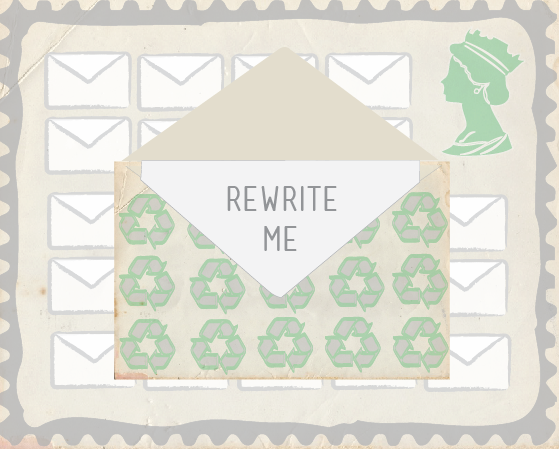
Developing the envelope visuals 


It was decided to make the stamp in a landscape format and it suits the imagery better and allows a more suitable layout. The queens head was inserted in the top right hand corner. A green colour was applied and the opacity lowered. A  grey frame also outlines the stamp. 


The size and shape of the frame was then experimented. The thinner version looks more neat and smarter. A texture was then applied as the background to tie in with the recycling paper theme. The identified class was also put in place next to the queens head. 


The aesthetics that had been developed were then applied to each stage of the stamp. 


A more suitable frame template was then found and used. 


This frame was then applied to each stamp to make the set come together. 


As most stamp booklets include six stamps, it was decided to add two more stamps into the process of recycling envelopes. When the book will be opened it will tell some sort of story.