End of module self-evaluation
- What skills have you developed
through this module and how effectively do you think you have applied
them?
The
first brief in this module was ‘Communication is a virus’. This was a group
project, which allowed me to develop voicing my opinions and working as a team.
Even though we have done group briefs before this one was with people that I
had chosen to work with. Sometimes, working with people that are your friends
can cause problems, but we found that it benefited our group. This brief was
the first time I had pitched an idea to a business in the environment. I feel
as though I have become more confident with my concepts and talking about them
to other people and adapting to situations. Each module has improved my illustrator
skills, in particularly the briefs set in this module. The ‘Stamp it brief’
asked to work as a small-scale, which challenged my design ideas and made me
work in a different perspective.
- What approaches to/methods of
design production have you developed and how have they informed your
design development process?
In
this module I think I have become better at spending more times on design
sheets and coming up with initial visuals and not rushing off to design the
final thing. ‘Communication is a virus’ brief allowed me to explore the
approach of interpreting something quite disconnected to the original starting
point. As a group we all had different approaches and methods of design
production but this is what made discover a few concepts before we finally
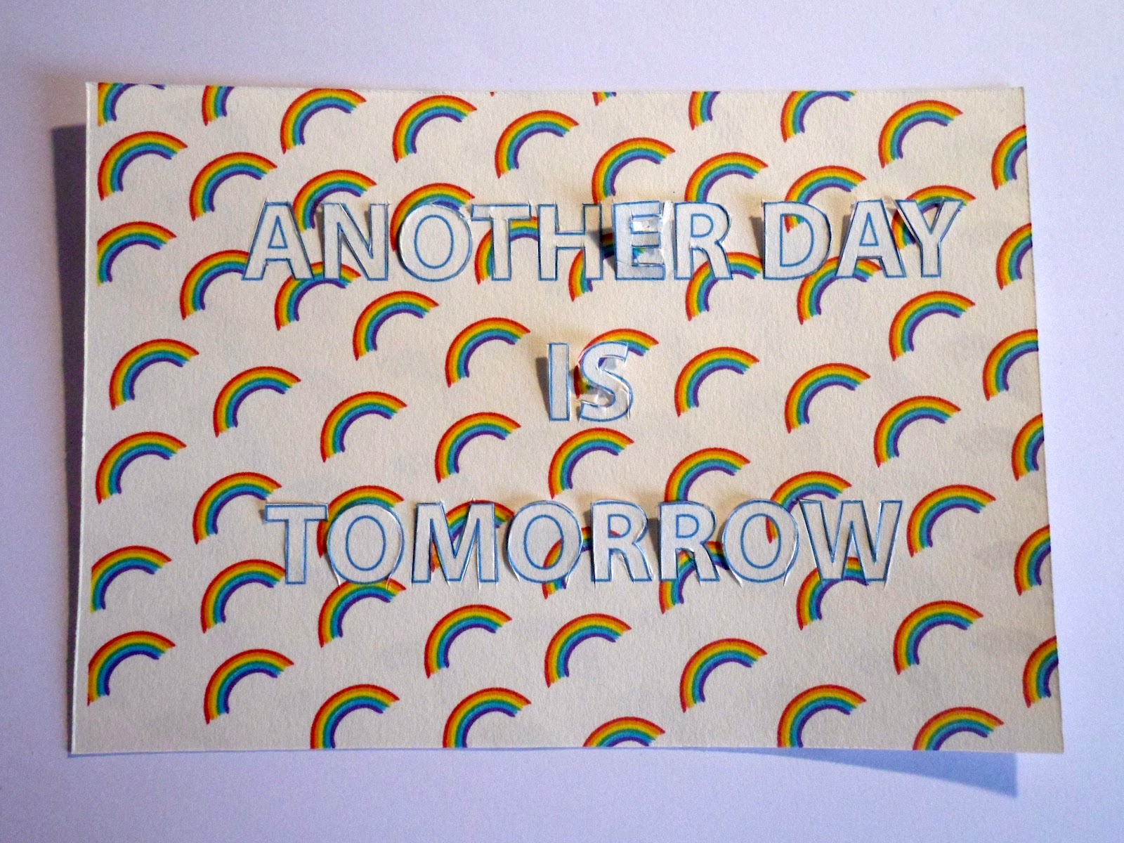
decided on a final point of enquiry. The ‘It’s your choice’ brief allowed me to
choose what brief I would like to revisit. I really enjoyed having a choice to
extend a previous project. I think because we were able to take it in any
direction I was able to really focus on the process of development.
- What strengths can you identify
in your work and how have/will you capitalise these?
I
think this module has improved my group skills and given me more confidence to
pitch my ideas. I feel as though in this module I have managed my time well and
have not felt as overwhelmed as I have done in previous modules. I think it is
partly because I have found the briefs really motivating and feel more
confident in my skills to complete them.
- What weaknesses can you identify
in your work and how will you address these in the future?
I think I still
have not really experimented that much with different outcomes and processes. I
would really of liked to screen printed my final ‘It’s your choice brief’. I
think I need to be more experimental with the media and stock I use. When it
comes to my blog I still think I need to write more in depth and be more
critical of my design. I also think it is important for me to be more selective
with what I show.
Attendance-
3 Quantity
of work produced- 3
Punctuality-
3
Quality of work produced- 3
Motivation-4
Contribution to the group- 4
Commitment- 4