Wednesday 29 February 2012
Design Principles//Type and Grid
Magazine Layouts
Here are eighteen magazine layouts that have been recreated by using images and aesthetics from the original.
Monday 27 February 2012
Friday 24 February 2012
Poster Brief//Development
To make the raindrops stand out more the union jack background has been washed out. Therefore the pattern of the background is still familiar and relatable to the audience.
Changing the colours of the raindrops draws the attention to the background of the poster rather then the focus point being on the rain. The colours of the union jack obviously represent Great Britain.
Inserting the droplets onto the the background brings back the rain imagery and ties in well with the umbrellas.
Developing a previous idea, here the union jack flag has been inserted as the background to make is more relatable to the brief.
Poster Brief//Development
'Only real surfers take shelter from the rain'
Taking the concept of promoting surfing in Britain and applying some aesthetics.
The idea of a surfer in the lip of the wave being sheltered from the rain shows a committed surfer. Someone who does something they are passionate about without letting anything get in their way, is a trait that should be linked to persistance and effort. These aspects that are being showcased are something that Britain should use to its advantage. The photographic image also shows the surfer wearing winter surf wear which aslo suggests how hard-core, enthusiastic and keen you have to be to surf in British winter waters.
Once the image was opened in photoshop, it was played around with. To experiment, a low opacity image of the union jack was applied as the background. Text was also added in white to stand out. The tagline 'Only real surfers take shelter in the rain' was chosen to communicate the concept.
Once the aesthetics on the main image had been decided on, a white border was added and the type and layout was experimented with.
Poster Brief//Development
Using a greyscale version of the union jack was experimented with as the background.
Inserting another background behind the text and the droplets emphasises the statement ever more. Also, the redness of the umbrella stands out really well against the multiple backgrounds.
Taking the raindrop pattern from the previous project, it has been inserted behind the text. The opacity of the pattern has been lowered making the droplets a lighter shade of blue and not over shadowing the text.
Here, the text has been changed to is something that fits in well with the illustration. It isn't so bold and less intense.
This is just the concept of an idea. Having someone amongst the text, 'taking shelter' is the idea that is being communicated. It is very simple and straight to the point. However, I do not feel like this text works well enough.
Here is a simple illustration which is going to be the starting point of the next idea.
Thursday 23 February 2012
Poster Brief//Development
'Shelter'
The message of the UK being a welcoming place full of places to go and things to see has given the idea of how there is always somewhere to seek comfort and explore new things.
Concept 1
A small bit of colour was added to the the rain pattern. The light blue agains the black outline umbrellas makes them really stand out.
To continue adding to the info graphic style, a rain pattern was added to the background. The angle of the droplets create a pulling force towards the typographical message. The simple but repetitive imagery enhances the central piece of the poster.
Type was inserted within the formation of the umbrellas as a focal point. At the moment the message and aesthetics do not link with Britain and providing shelter.
A simple circle of umbrella illustrations were formed using Illustrator. The black outline and white fill keeps the repetitive imagery simple.
Concept Two
The typeface was changed to something more suitable to the. This font works better with the colour ways and yet it is still powerful enough on its own.
Type was applied against a low opacity rain background to bring the strength of the wording. Also a blue shadow of the typeface was added to enhance the message.
Firstly a diagonal rain pattern was created in illustrator as a stating point.
Wednesday 22 February 2012
Poster Brief//Design Sheets
A few design sheets were put together to identify some concepts. The ideas consist of some more historically focused and others based on a more general view. Looking into English heritage seemed a good staring point, in particularly the Roman baths. This was mainly because of the interesting way that rain contributed to the British tourist attraction.
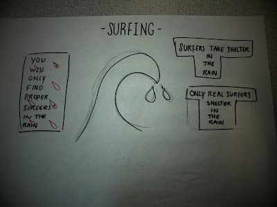
Another concept was looking into water-sports, mainly surfing, as it is an activity that is extremely effected by the weather. Often it people put sun and sea together. But often, rain and wind can improve the swell and increase the wave height.
The word shelter is used in many ways. Whether it is shelter from rain or used in a more general sense. Shelter is a word of safety therefore linking it to Britain is something of a selling point. When people travel from other countries, they want to feel safe and welcome. If this can be portrayed through a poster promoting the UK then it would be an effective concept.
Saturday 18 February 2012
Subscribe to:
Posts (Atom)


