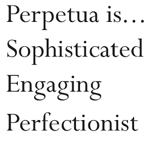
Taken from the typography task, giving the typeface three personality traits was the next challenge. Each typeface communicates a different message and tone depending on its aesthetics. Basically saying, if the typeface was person was aspects of their personality would be emphasised. The following words below is how Perpetua came across.
A brand that the typeface would communicate well:
A brand that the typeface would NOT communicate well:
Kerning
It is important to considerate how to kern type in order for it be as legible as possible. Kerning is the space between each letter. Making it bigger or smaller will determine the aesthetics of the word or sentence.
Composition
The next task was to take the numbers in written form; three, two one. Then by experimenting with the point size, layout and weight try and and make it read 'One, two, three'.
. . . . . . . . . . . . . . . . . . . . . . . . . . . . .
. . . . . . . . . . . . . . . . . . . . . . . . . . . . .
. . . . . . . . . . . . . . . . . . . . . . . . . . . . .
. . . . . . . . . . . . . . . . . . . . . . . . . . . . .
. . . . . . . . . . . . . . . . . . . . . . . . . . . . .
. . . . . . . . . . . . . . . . . . . . . . . . . . . . .


No comments:
Post a Comment