What is a website for?
- Promotion
- Informing
- Persuasion
- Contact
- Entertainment
The audience is NEVER for everyone.
Three factors of a website
- Check it actually works (functionality)
- Aesthetics-is it visually appealing?
- Does it work well? (usability)
Making a website
- Landing pages?-For every page, ask why?, what is the point?
- Need a contact page-Email, physical location and address, telephone number, business networking and online presence.
- About page- Is it relevant to the clients who want to appeal to?
- A CV page-If you show your portfolio do they need to see your CV? Let the work speak for itself.
- A shop-Depending what type of designer your are.
- A blog/news feed could go on Homepage to show active work and what is currently going on in terms of your design.
- Clean layout But unoriginal-make it different.
- Navigation
- Redundant features- get rid of them.
KISS- Keep, it simple stupid.
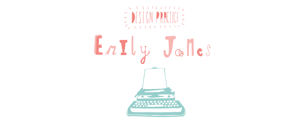
This is the homepage that I designed for myself. I decided to go for something more illustrative as this reflects my practice. I thought that the typewriter could be a place of daily blog updates and what is going on. The scroll bar on the right will be a way of scrolling down te paper on the typewriter therefore making it more interactive. The navigation is placed across the top as this is a clear location to put it and people are familiar with this sort of layout.
This this the feedback received:

.jpg)


No comments:
Post a Comment