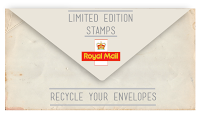
Along with the design of the stamps, a booklet needs to be created that also fits to the brief. The idea of having the front cover as an envelope does ties in well with the message being communicated and the aesthetics.
Firstly, using illustrator, the envelope was created and a pattern applied.
The opacity of the pattern on the envelope was then lowered and text was inserted along with the royal mail logo.
Then the layout of the contents on the envelope was experimented with.
The opacity and background was lowered to create a more authentic effect.


No comments:
Post a Comment