Developing the envelope visuals
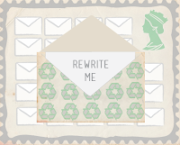
It was decided to make the stamp in a landscape format and it suits the imagery better and allows a more suitable layout. The queens head was inserted in the top right hand corner. A green colour was applied and the opacity lowered. A grey frame also outlines the stamp.
The size and shape of the frame was then experimented. The thinner version looks more neat and smarter. A texture was then applied as the background to tie in with the recycling paper theme. The identified class was also put in place next to the queens head.
The aesthetics that had been developed were then applied to each stage of the stamp.
A more suitable frame template was then found and used.
This frame was then applied to each stamp to make the set come together.
As most stamp booklets include six stamps, it was decided to add two more stamps into the process of recycling envelopes. When the book will be opened it will tell some sort of story.


No comments:
Post a Comment