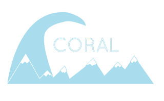
Here are some ideas of the logo, it is important that both snow and surf are communicated within the imagery.
Even though these logos above have surf and snow imagery it doesn't really have the aesthetics of a logo. The type looks to much out of the imagery and doesn't link together.
Here is a simpler design but in a more constrained areas. The colour filled diamond and then the dashed outline gives it a solid but also feminine feel. The snow and surf imagery is also more incorporated into the shape as a whole.


No comments:
Post a Comment