Here is the main contents of the website on the css stylesheet.
Once the position has been decided of these elements they need to be entered in the source code so it links together.
Here are the buttons of for the website. They were made in Photoshop and are 204 pixels wide by 40 pixels height. The buttons have two versions, known as a 'rollover image'. This means that when you hover over the button the text will change. In this case the type will change colour. The font being used is 'HillHouse' as it matches the aesthetics of the brand.
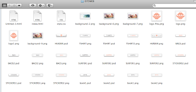
Here is what the 'Route folder' looks like which contains the HTML.


No comments:
Post a Comment