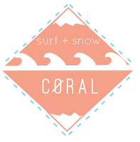
After creating a product range with the logo applied, something about didn't look right. The image look almost uneven. Also, the waves facing downwards lost the aesthetic aspect so by turning them upwards they look more like waves. Too make the logo seem more compact, a mirro image was created and put into a square shape. This therefore gives the logo a bolder outline and an easier identify to apply to products.
Colour was also experimented with. Using two colours rather than one was applied, but the logo gives a stronger aesthetic with a block colour. The blue was experimented with as it portrays cold weather and icy imagery but also water, blue skies and waves. However the coral is more feminine and compliments the name.


No comments:
Post a Comment