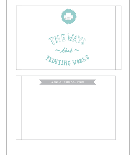
The booklets are obviously a set of three so here is the design of the sleeve that will keep them all together. The sleeve will be printed on A3 as thats the smallest size that the net can be fitted on.
Friday, 30 November 2012
Design for Web//Making website
First of all a 'History of' template was created. As each page has the same layout it is quite simple. Their are five pages so each of these needed to be made into a HTML.
Thursday, 29 November 2012
Design for print//Development from crit
Overall, the colour modes book had the most positive feedback out of the set. The only thing changed on this booklet is the leading to make the type for legible. In fact, it was the layout and hierarchy of this booklet that influenced the change of the others.
Wednesday, 28 November 2012
Design for print//Development from crit
Similarly to the last, to improve the formatting booklet, the hierarchy and layout was changed to keep as a set with the others and it is the most effective. The 'A' formatting diagram was also changed to magenta instead of red.
Tuesday, 27 November 2012
Design for Print//Developing from crit
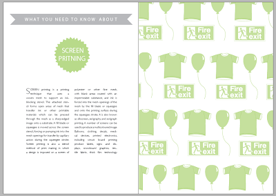
After getting feedback from the crit, it was suggested that the illustrations within the 'printing' handbook looked a bit lost in the page and left a lot of white space. Taking this on board, using the original illustrations, a repeated pattern was created using a clipping mask in illustrator. This makes the pages look like their is more going on while still communicating examples of the print process. The layout with the left page was also rethought out. In the crit it was suggested that the hierarchy worked best in the 'colour modes' book so therefore the other books have been altered to match this layout.
Sunday, 25 November 2012
Design for web//Crit
Here are the boards created for the crit. Their are various designs as it has not been decided which one would be the most effective.
Feedback
Strengths
- Wire frame is good, very clear with instructions/measurements.
- Logo on the bottom of each slide shows illustrations.
- Clear, readable type for title pages.
- Great use of illustrations to convey in subject matter.
- Slide show three is the best. Header at the top makes the website consistant.
Areas for improvement
- Place borders around each window.
- The block capitals of the links don't quite go with the aesthetic of the rest of the site.
- Maybe increase the weight of the type. Look at the alignment as well.
- Make the illustrations more colours and a keeping consistently in the colour.
Saturday, 24 November 2012
Design for web//'A history of...' design
Here is the Y-Frame for a potential website design. The website is going to be 1024 x 769 pixels. The y-frame is based upon the scamp below.
To measure out certain areas of the web page, in Photoshop, the sizes of columns, borders and boxes were experimented with to see how the layout would look.
Using illustrator, a grid was set as the background to attempt to layout grid based on the y-frame. It is centred around three colours so it's equally divided by the width of the page (1024px) including a border.
Using the type from the original 'History of' project, a grid made up of subject areas was created. For now, the border was taken away just as their may not be enough space with it. Therefore, with all the content it make look overcrowded and ruin the aesthetics.
The illustrations from the project were then inserted in the same place as their matching type description. The idea is that when you come to the homepage the type images will appear and as you roll over each of these images, the matching subject illustration will appear. A title was also put in on the type right hand corner.
The layout was getting a bit overcrowded so it was decided to centre the type images/illustrations on the web page so they are more a focal point. The title was taken away and the bottom pattern and shape was copied and mirrored to be placed on the top, creating a sort of border.
The same was then done with the type images.
To see what the web page would look like, the grid was taken away and the boxes surrounding the images. The layout of the image still look like they are in a grid set up with makes the aesthetics clear and legible.
Here is another Y-frame based on a different scamp. It is much more simplistic and not as much imagery involved. Once again it is the same height and widths as the previous Y-frame.
On Illustrator, a gird was set as the background to make sure images are placed in correctly. Using the same pattern as before, this has been inserted as a separator between where the title/content will go and the page links.
The page links were then placed at the top. The width of the page (1024 px) was divided by six as that is how many subject areas there are going to be.
The content will go where the 'Istanbul' title is on each subject, therefore it is the same layout on each page. An additional patterned border is added at the bottom of the page to give an illusion that the content will be in a constricted area.
Friday, 23 November 2012
Live Brief//Feedback from concept pitch
- Like the idea of the whole package (cards, stamps, envelopes, labels), is definitely more appealing.
- How about a do it your own card kit with alternative images and text, making it more personal and fun.
- Make sure to specify target audience
- Take inspiration from designs that are aimed at this audience.
ACTION PLAN
Research
- Specific target audience
- What the target audience are into
- What prints and patterns are already out there
- Innovative packaging ideas
- Greeting cards
Development
- Product-Pattern design
- Draw up some ideas
- Screen printing-processes
- Make some mock ups of packaging
Production
- How is it going to be displayed and promoted?
- Start creating the products
- Costing
Subscribe to:
Comments (Atom)






.JPG)
.JPG)
.JPG)
.JPG)


