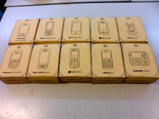
Final Ten Products
These images below display the final construction of the design idea. The plan was for the products to all work as a set which is demonstrated visually. Each box obviously has the same aesthetics from a far, yet each displays a different selling point of a different phone.
The illustration style works well agains the textured background. However it may be argued that the main image isn't reflective enough of the real phone. This is why on the side of the box a photograph image has been inserted.
The back of the box sees the communication of what was found while researching the link between social media and mobiles. As info-graphics started the project off, it was important to input what had been learnt throughout the module, when it came to the final piece. Even though sometimes it was a struggle to interpret things and put them into an info-graphic style, it ended up working well and the tied in well with the aesthetics of the box.
Designing a packaging for a mobile phone meant that their still had to be an element of familiarization. It still had to communicate what was inside the box and the features the phone had. To keep this simple, a grid presentation was the most direct and clear way. This display of information is itself, info-graphics.


No comments:
Post a Comment