Feedback
The progress of the crit was extremely helpful. The feedback was a detailed analysis of the work and some in depth suggestions on how the posters could be improved. It was also good to to spend a good amount of time looking at someone else's work and telling them a different view and opinion. Overall it is a successful crit progress.
After receiving feedback, through experimentation and taking in ideas and suggestions, here are some changes to the posters:
With comments suggesting that the type-face was too soft, a bolder, hard-hitting font has replaced it. This font (Futura) is now much more impacting and draws more attention. However it isn't too intimidating or overpowering and the styles and colours fit in well with the rest of the design.
For the image only poster it was suggested that instead of the imagery suggesting you can see how deep the see is, you can't. By bringing the iceberg and boat image down to nearly the bottom of the poster it communicates that you are unaware of what is going on underneath or how much is going on.
The last poster shows that the iceberg and been made a bit more 3-D. This was done by adding thicker and more brush like strokes. Also the intensity of shadow was increased. However it hasn't gone overboard with the 3-D effect as the feedback showed that it was the strong, simple white lines that give impact. Therefore some of this has remained in the design.
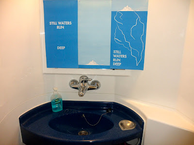
Here are a couple of photographs of what the posters look like when set out in the appropriate format. In contrast to the previous design, the type definitely stands out and the middle poster gives a sense of ambiguity. Overall the posters are communicating the proverb in a more impacting way.
Posters In context
To present the posters in context, they were photographed above a sink. The reason being that as the design has developed it has subtly become an environmental series of posters. Therefore where people are going to wash their hands or use water would be a great place for them to communicate the message.


No comments:
Post a Comment