1. Alphabet Soup//Extract
The first project was based around type. I was given the word 'Extract' and had to communicate this word through a variation of one letterform. I picked the letter 'O' which I quickly regretted as it didn't really give me enough to work with. I found it quite difficult to apply my definition on a typeface. It was hard to find the balance between being too obvious but also lacking concept. I really enjoyed how specific the brief was though. We were only allowed to used black and white and it had to be hand-rendered. Considering it was our first brief I think it was effective that we didn't have too much to think about.
2.Alphabet soup//Partner
Continuing to improve our knowledge on type and design, we were set out to design a typeface for a partner that we were put with. A pre set of questions helped us get to know the individual and therefore create an alphabet that was relavent and valid. Once again it was a specific brief when it came to stock and colourways. I really enjoyed exploring the concept side of this project. At first I found it difficult to find a design that would work for every letter of the alphabet. I decided that it needed to be simple in order for it to be effective. As I discovered my partner was quite a private and shy person on the inside but came across confident on the outside I decided to use the concept of layers. My partner was really happy with the typeface that I produced.
3. Porverbally yours//Still waters run deep
This project saw the development of three posters communicating the proverb; still waters run deep. Again, the brief was very specific which allowed me to just think about the ideas leading up to the final piece rather than worrying smaller details. Also, this was the first time I had really used illustrator so it was a good opportunity for me to experiment with imagery on the programme.
4. Proverbally yours//Mail shot
The next brief was linked to the previous one. We were given an occupations, mine being a scientist. It was then our responsibility to link our proverb with our occupation. By coincidence mine had a quite a clear link however it did take me while to find something relavent to communicate. I settled with promoting the BBC's programme 'Frozen planet'. I used similar imagery and colourways to the previous brief which made it look like a set. This project also gave me the opportunity to expand my skills on illustrator and become more confident in using the tools.
5. How to//Paper plane
This was a group brief where we were given the question 'How to make a paper plane'. It was less specific to other briefs and allowed more end outcomes. As a group and doing individual research we decided to create an instant messaging app basing it around our theme. I enjoyed creating something more digital. It was a different approach to anything I had done before. I also really enjoy working as part of a group because I learnt so much from other people. Everyone has different ideas and approaches, so its good to take on peoples strengths. However, you have to be more organized with your time as a group. It is sometimes hard to find times where everyone is around and puts in the same amount of effort.
6. How to//100 Things
I found this the most challenging brief yet. It very much based on a lot of research which I found interesting but sometimes I found it difficult to bring it all together and apply it to design development. However this project did make me realise how important both primary and secondary research is and the process in which to go about it. With this project I did feel a little let own with my final ten products considering the amount of research I did. I think this may have been because I didn't focus enough on the design side of things. I aslo think I could have done a variation of products rather than ten of the same products. On the other hand, I am really glad that I managed to apply the research that I a had explored into info-graphics and put them on my products.
7. The poster brief
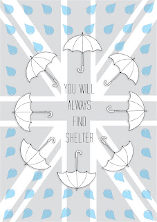
The poster brief was the first live brief that we had experienced on the course so far. It was new and exciting to answer to a brief that was set by a different audience. With a short time scale it was important to create visuals quickly. However, like every brief, research into the background needs to be done. Especially as the project was asking us to promote Britain and its rainy weather. It was key to find a concept that could communicate this. I decided to use 'shelter' as my way in encouraging people to come to Britain. Also as I was designing as a poster I thought that have simple but appropriate imagery would get the message straight to the point.
8. Communication is a virus
This brief was another group task. Like the previous one, their were lots of possible outcomes and allowed us to self direct the brief. We chose to base our project around giving more and therefore 'giving a smile'. We came across a few difficulties, one of them being who are target audience was going to be. We started off with an office audience but after feedback we decided to make it a bit broader. We designed some take away coffee sleeves with light hearted and witty humour that we thought people would enjoy. We made a decision to actually put them out into the environment. This was the first time we had a ever put our work out there to be tested. It was an interesting experience that we all learned a lot from .
9. Stamp it
This was the most recent project that I have completed in the latest design module. We had to design a set of six stamps promoting a greener world and encouraging people to change their actions to do this. After coming up with a few obvious ideas I decided I needed something that was relavent to the brief and something easy that people could do. So as the project was asking to design stamps, I decided to encourage people to reuse their envelopes rather than buying a new one every time they send a letter. This is saving paper, money and helping the environment. I really enjoyed this brief and got some really good feedback that I would like to take further.


No comments:
Post a Comment